I have always been compelled by infographics. From basic maps to advanced Tufte graphics, the data visualization ties my love for research and analysis with my interest in design. Here are five of my favourite infographics about cities.
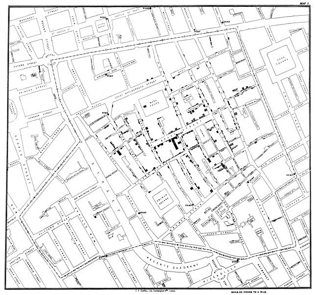
Broad Street Cholera Outbreak
Perhaps the first urban data visulization—and one of the most important—John Snow’s map shows the clusters of cholera cases along Broad Street (now Broadwick St) in the London epidemic of 1854. Snow’s study was a major event in the history of public health, and is regarded as a founding event of epidemiology.
New York Subway Map (1972)
Massimo Vignelli’s now-famous intertwined wiring-diagram map of New York’s subway lines was influenced by Harry Beck’s 1933 London Underground map. It became a design classic for its efforts to clarify the city’s complicated subway routes. In the words of a MTA spokesperson at the time: “There’s no sence in using a transit map for geography lesson.” Too bad New Yorkers disagreed; due to staunch resistance the map was replaced in 1979 with a more spatially accurate map by John Tauranac and Mike Hertz.
Where Tourists Really Flock
Eric Fischer’s maps of Flickr photos in major cities illustrates the split between tourists and locals. Blue pictures are by locals. Red pictures are by tourists. Yellow pictures might be by either.
Here’s Eric’s map of Vancouver BC. See the full set on Flickr.
What a Hundred Million Calls to 311 Reveal About New York
There were 34,522 complaints called in to 311 between September 8 and September 15, 2010. Here are the most common, plotted by time of day. These calls represent a huge pool of data and points the way toward creative ways for residents to document their problems; and ultimately, the crowdsourced cities. From Wired.com.
Who’s Got the Worst Urban Sprawl?
Never underestimate the power of designers to turn one of the ugliest facets of cities into something approaching art. Commissioned by the Rice University School of Architecture, this infographic by the Brooklyn graphic design studio Thumb compares 27 ring roads around the world—like the D.C. Beltway and the London Orbital. It received a 2010 ID Annual Awards Design Distinction award.
These are but a small cross-section of my own favourite attempts at visualizing city data. Here are links to a few more of may favourites.
- Cost of Owning a Car
- America’s Best and Worst Commutes
- Bike-opolis
- Dead Man Walking
- What’s in a Surname?
Your Turn
I’m sure that I have missed some other great examples of urban infographics, both old and new. Please let me know your favorites in the comments section.


2 thoughts on “5 of the Best Urban Infographics”
Comments are closed.